Timesheet Reports let you review logged hours by user, project, or custom grouping, and compare them against required or planned capacity. For the submission and approval workflow, see Timesheets Approval.
Toolbar & Filters Back to top
Every Timesheets view shares the same toolbar at the top — controls work identically across all sub-views.

- Period — eight presets (Current / Previous Week, Month, Quarter, Year) plus a custom date range. Use ← / → to step one period at a time; Today jumps back to the period containing the current date.
- Day / Week / Month — sets column granularity across the whole table. Day shows one column per calendar day, with non-working days shaded per your configured work days (Settings → General, or the default capacity scheme); Week and Month aggregate totals into broader buckets.
- Team / Users or Jira Filter — two mutually exclusive row scopes. Team/Users lets you pick individuals or whole teams. Jira Filter scopes to worklogs on issues matched by a saved Jira filter — when active, allocation entries are hidden and the Worklog Type section disappears.
- Filter — a single dropdown that narrows the results by Projects, Worklog Type (Issue, Allocation, or Both), and Category. Each section defaults to "all"; the Category section only appears when more than one worklog category is configured. Worklog Type is hidden when a Jira Filter is active.
- Active filter chips appear below the toolbar for every active selection. Clear all resets all filters at once.
- Export Excel — downloads the full visible timesheet as a formatted spreadsheet with color coding, frozen headers, and native row grouping for hierarchical views.
Clicking a cell
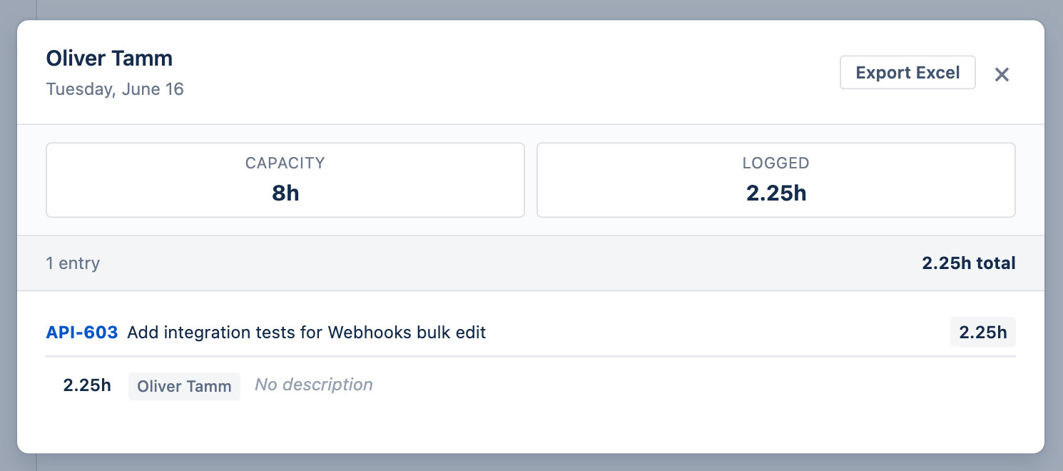
Click any cell to open a detail dialog showing everything logged (and taken as leave) for that person on that date. At the top you see Capacity (daily required hours) and Logged (total hours logged). Below that, entries are listed per date in this order:
- Leave entries — shown first with a red LEAVE badge, the leave type name (e.g. Vacation, Sick Leave), and duration (Full day or partial hours). Only approved leaves are shown.
- Worklog entries — grouped by issue, each showing the issue key, summary, hours, author, and description. When more than one worklog category is configured, each entry also shows its category, which reviewers with edit rights can change inline.
If someone both took leave and logged work on the same day, the cell is highlighted as a conflict and the dialog surfaces both so you can review the overlap. An Export Excel button lets you download the entries shown.
Cell Colors Back to top
In User Timesheets and Custom Timesheets (when grouped by Worklog Author), each cell on a user row is tinted based on the ratio of logged hours to that person’s available capacity. The tint follows each person’s own capacity scheme — a day that is non-working org-wide but working for that person still colors normally. The same palette is used in Progress Reports and the Resource Scheduler, so the meaning is consistent across the whole plugin.
| Color | Logged / Capacity | Meaning |
|---|---|---|
| Light Blue | < 50% | Underloaded — significant spare capacity |
| Yellow-Green | 50 – 80% | Moderate load — partially loaded, room for more |
| Green | 80 – 100% | On track — healthy target utilization |
| Yellow | 100 – 120% | Near overload — logged more than available capacity |
| Red | > 120% | Overloaded — or work logged on a leave, holiday, or non-working day (Day scope only) |
| Blue | — | Approved leave day with no logged work (Day scope only) |
| Orange | — | Public holiday with no logged work (Day scope only) |
User & Project Timesheets Back to top
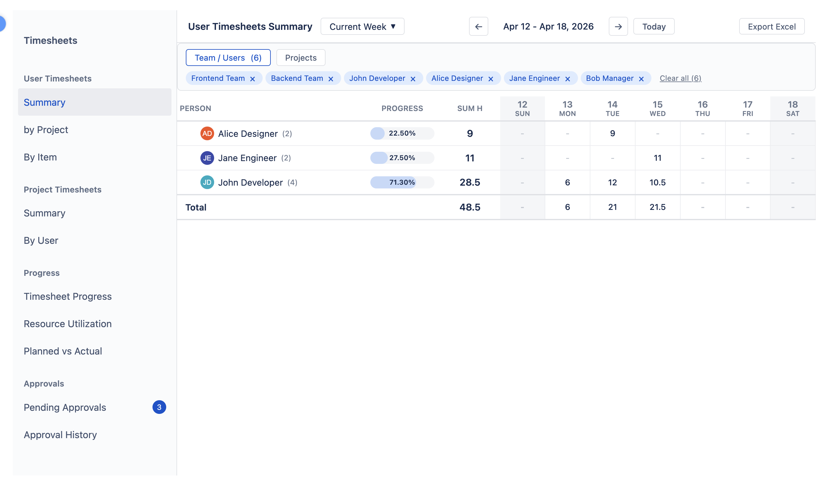
User Timesheets shows logged hours from each person’s perspective, with three sub-views selectable from the left sidebar:
- Summary — one row per person with total hours per period column.
- By Project — expandable Person → Project tree; click a person row to see their hours split by project.
- By Item — Person → Issue / Allocation breakdown with worklog descriptions visible per entry. Allocation entries with a custom title show it alongside the target ("title | target"), and the same combined label appears in cell popups and the worklog report.
Project Timesheets shows the same data from the project side:
- Summary — one row per Jira project with total hours logged across the period.
- By User — expandable Project → Person tree showing each contributor’s hours.
Detailed Timesheet Back to top
The Detailed Timesheet shows every worklog as its own row in a flat table — useful when you need to audit, search, or export individual entries rather than see aggregated totals. Unlike the timeline views, there are no date columns; each row stands alone with its own date, user, project, issue, hours, and description.
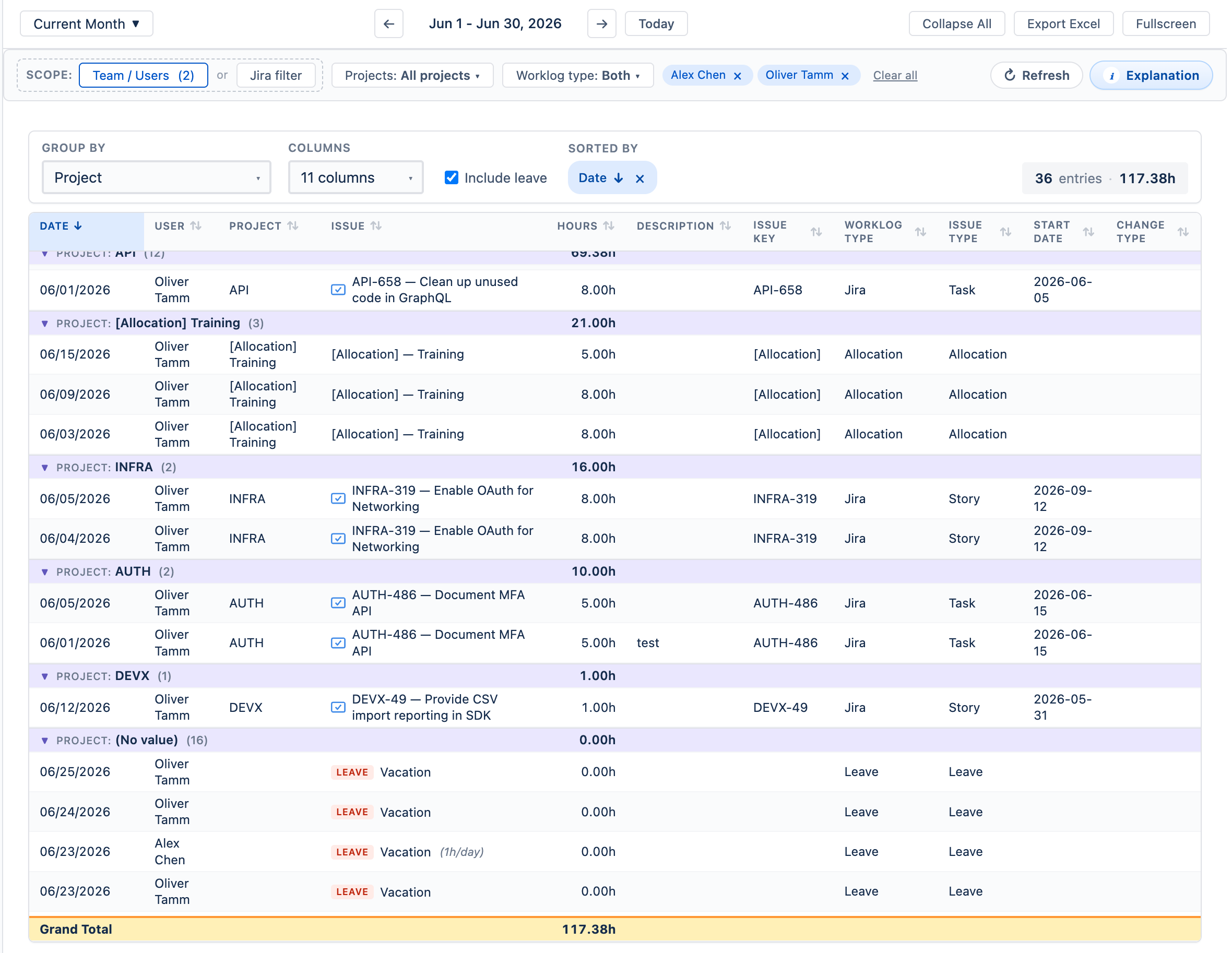
- Group By — optionally group rows by any single Jira field (e.g. Project, User, Issue Type) or by worklog Category. Each group shows a subtotal. Leave the field empty for a flat unsorted list.
- Columns — choose which columns to display. Available fields include Date, User, Project, Issue, Hours, Description, Issue Key, Worklog Type, Issue Type, Start Date, Change Type, and (when more than one worklog category is configured) Category. In the Category column, reviewers with edit rights can retag an entry inline.
- Include leave — checkbox to show approved leave entries alongside worklogs. Leave rows display the leave type with a red LEAVE badge; partial-day leaves show the hours per day (e.g. 1h/day).
- Sorted By — click any column header to sort; the active sort is shown as a chip above the table and can be cleared.
- Grand Total — a pinned row at the bottom sums all hours in the current view.
Progress Reports Back to top
Three dedicated reports each compare hours across two dimensions. Cells are color-coded: blue = under capacity, green = on track, yellow / red = over capacity. For split issues, planned hours come from each person's parts rather than the issue's own estimate.
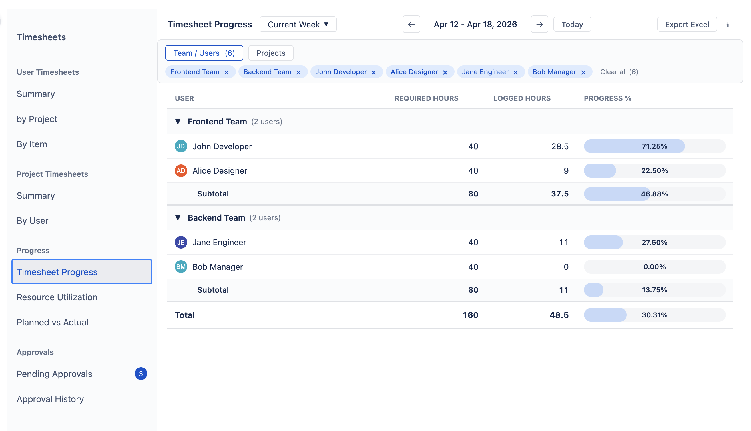
Timesheet Progress — Required vs. Logged
Compares how many hours each person was expected to work (their required capacity) against how many hours they actually logged. Use it to check whether timesheets are being filled in fully.
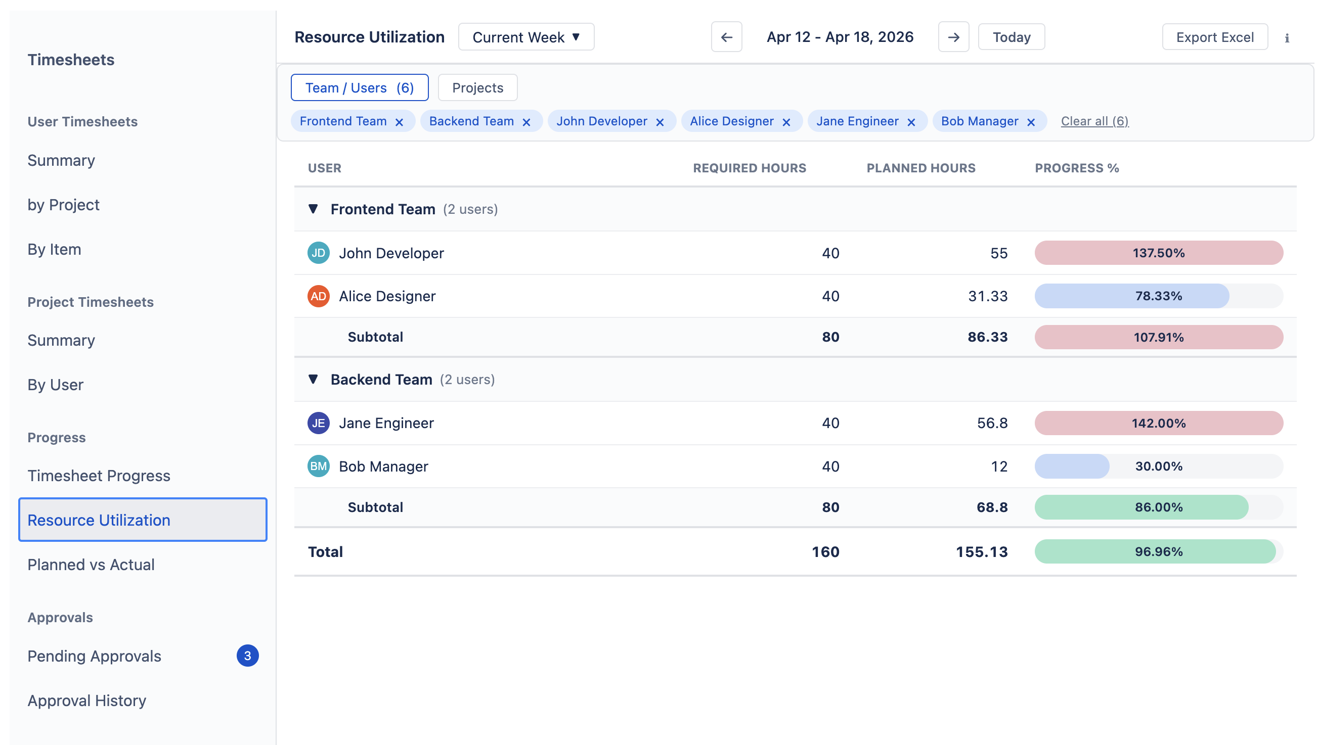
Resource Utilization — Required vs. Planned
Compares required capacity against planned work (original estimates distributed across working days, plus allocations). Use it to spot overbooking before the work begins — if someone exceeds 100%, their planned workload is more than their available hours.
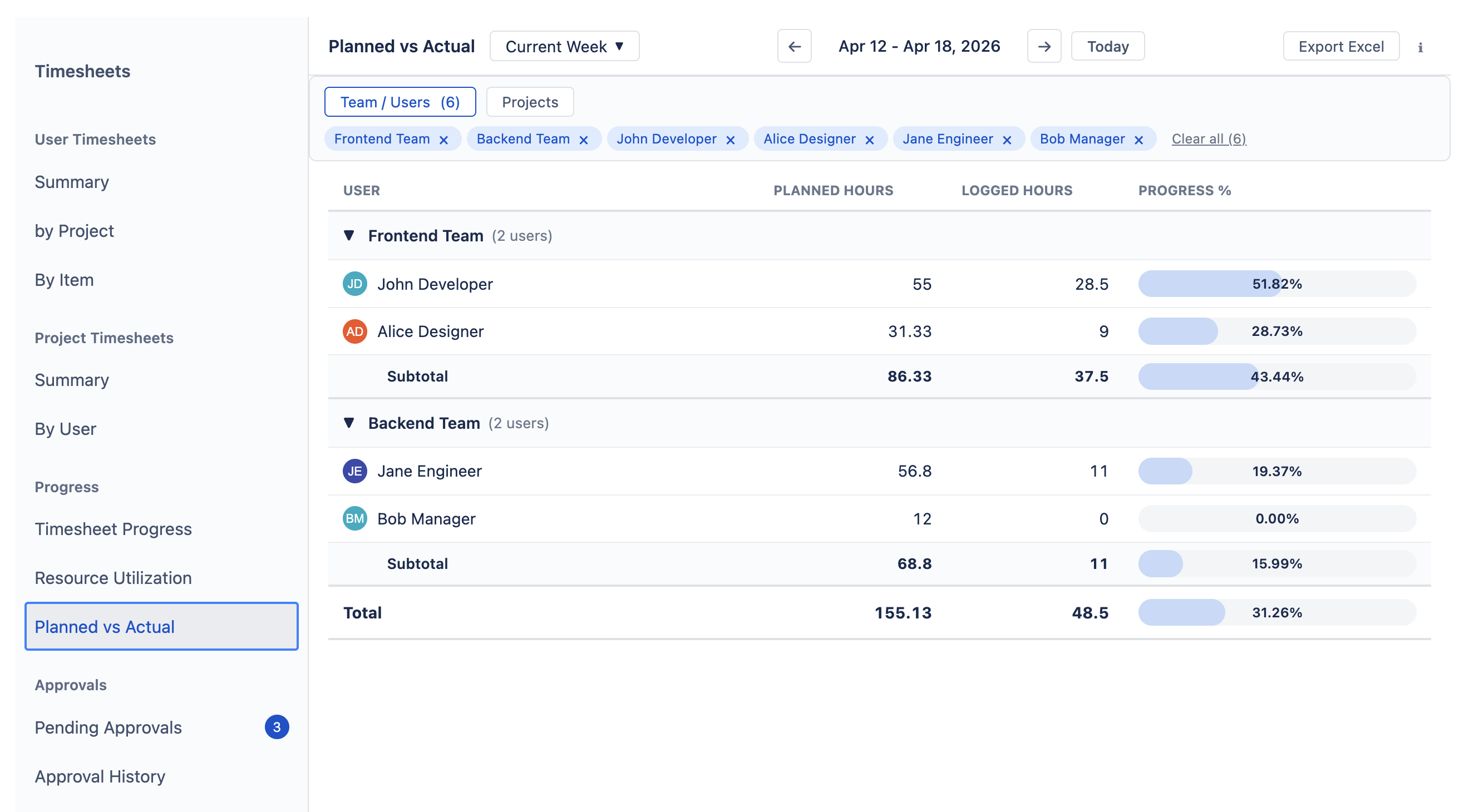
Planned vs. Actual — Planned vs. Logged
Compares what was planned against what was actually logged. Run this after a sprint or period end to see whether estimates held up — if logged hours consistently exceed planned, your team may be underestimating.
Display modes
All three Progress reports share five display modes — switch using the segmented control above the table. The data is identical; only the visual density changes.
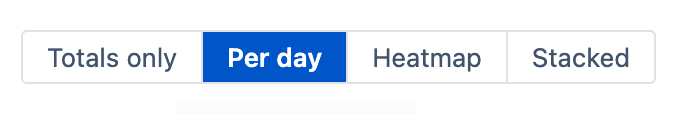
- Bar — a progress bar per row showing the overall ratio at a glance.
- Per Day — inline values per column: numerator / denominator with a signed delta (e.g.
13/8 +5). - Heatmap — color-coded cell backgrounds with only the delta shown; ideal for scanning many people at once.
- Stacked — numerator and denominator stacked vertically in each cell.
- Totals Only — hides per-day columns and shows only the period summary totals.
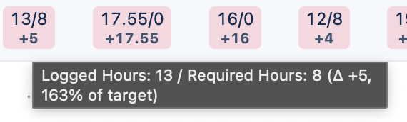
In Per Day, Heatmap, and Stacked modes, hover over any day cell to see a tooltip with the full breakdown — both values, the delta, and the percentage of target (e.g. Logged Hours: 13 / Required Hours: 8 (Δ +5, 163% of target)).
Custom Timesheets Back to top
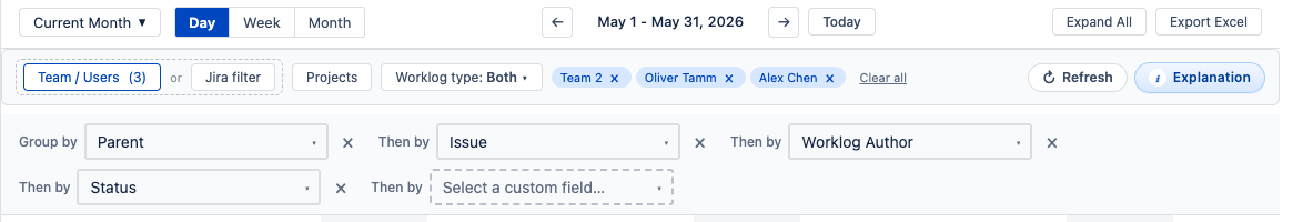
Custom Timesheets work the same way as User & Project Timesheets — the same toolbar, filters, period picker, and clickable cells — but instead of fixed groupings you define your own hierarchy using any Jira field. This lets you build deeper, more specific breakdowns that the standard views don't offer.
You can stack up to 5 levels. For example: Worklog Author → Project → Epic → Issue Type gives you a per-person view broken down all the way to issue type — something neither User nor Project Timesheets can show alone. Items with no value for the selected field are grouped under “(No value)”. When a field holds several values at once (labels, multiple sprints, multi-select), the item is grouped under a single combined bucket listing those values together (e.g. “backend, frontend”) so its hours are counted once, never split across the individual values.
When Worklog Author (or Assignee) is the top-level grouping, date cells get the same workload color coding as User Timesheets — blue through green to red based on logged hours vs. capacity. Deeper nesting levels always show plain hour totals. Group rows have a light silver tint while the deepest rows stay white, so individual entries are easy to spot in an expanded hierarchy.
Who sees whose timesheets Back to top
Timesheets are sensitive personal data, so visibility is stricter than elsewhere in the plugin. Regular users see only their own hours; team managers and approvers see their assigned team members; admins see everyone. The full access rules are in Permissions › Who Sees Whose Timesheets.
Need Help?
If you have questions about timesheets or need help with your setup, our support team is here to help.
Contact Support